In this tutorial, we will use the penguins dataset from the palmerpenguins package in R to examine the relationship between the predictors, bill length and flipper length, and the outcome species (which has 3 categories).
1. Loading the data
We will start by loading the necessary packages and summarizing the data:
library(tidyverse) # for data manipulation and plotting
library(tidymodels) # for modeling
library(palmerpenguins) # for loading the data

# load data and keep useful variables only
penguins <- penguins |>
  select(bill_length_mm, flipper_length_mm, species)

summary(penguins)
# bill_length_mm  flipper_length_mm      species
# Min.   :32.10   Min.   :172.0     Adelie   :152
# 1st Qu.:39.23   1st Qu.:190.0     Chinstrap: 68
# Median :44.45   Median :197.0     Gentoo   :124
# Mean   :43.92   Mean   :200.9
# 3rd Qu.:48.50   3rd Qu.:213.0
# Max.   :59.60   Max.   :231.0
# NA's   :2       NA's   :2
2. Fitting a multinomial logistic regression
The function multinom_reg() from the package tidymodels defines a multinomial logistic regression model which then should be fitted to the data:
# fit a multinomial logistic model
model_fit <- multinom_reg() |>
  fit(species ~ bill_length_mm + flipper_length_mm, data = penguins)
3. Explain the relationship between predictors and outcome
In order to print the model’s coefficients, p-values, and confidence intervals, we need to do 5 things:
- First, call the function
tidy()on the model fit to extract the coefficients and p-values. - Add the argument
exponentiate = TRUEinside the functiontidy()to exponentiate the coefficients (to get odds instead of log odds). - Also, specify
conf.int = TRUEto print the 95% confidence intervals. - Round the output values to 4 decimal places for all numeric outputs to make them more readable.
- Finally, remove the standard errors and z-scores from the output to make the table smaller.
# explain the relationship between predictors and outcome
tidy(model_fit, exponentiate = TRUE, conf.int = TRUE) |>
  mutate_if(is.numeric, round, 4) |>
  select(-std.error, -statistic)
## A tibble: 6 x 6
#   y.level   term              estimate p.value conf.low conf.high
#   <chr>     <chr>                <dbl>   <dbl>    <dbl>     <dbl>
# 1 Chinstrap (Intercept)          0      0.0074    0        0.0008
# 2 Chinstrap bill_length_mm       3.85   0         2.45     6.04
# 3 Chinstrap flipper_length_mm    0.844  0.0087    0.743    0.958
# 4 Gentoo    (Intercept)          0      0         0        0
# 5 Gentoo    bill_length_mm       1.62   0.0228    1.07     2.45
# 6 Gentoo    flipper_length_mm    1.62   0         1.47     1.78
The column estimate contains the exponentiated coefficients, which can be interpreted as follows:
For example, reading lines 2 and 5 of the output, we can say that:
A penguin’s bill length significantly differentiates (p < 0.05) a Chinstrap from an Adelie (the reference category), and also a Gentoo from an Adelie. Specifically, a 1mm longer bill multiplies the odds of being Chinstrap versus Adelie by 3.85, and the odds of being Gentoo versus Adelie by 1.62.
Alternatively, we can say that:
A penguin with a 1mm longer bill has 285% (3.85 – 1 = 2.85) more odds of being Chinstrap versus Adelie, and 62% (1.62 – 1 = 0.62) more odds of being Gentoo versus Adelie.
Note: If we don’t want Adelie to be the reference category, we can change it using the following code:
# set the reference category
penguins$species <- relevel(penguins$species, ref = "Gentoo")
4. Evaluate model performance
# evaluate model performance
glance(model_fit)
## A tibble: 1 x 4
#    edf deviance   AIC  nobs
#  <dbl>    <dbl> <dbl> <int>
#1     6     78.1  90.1   342
Deviance measures the goodness of fit of a logistic regression model. A deviance of 0 means that the model describes the data perfectly, and a higher value corresponds to a less accurate model. (for more information about deviance, see this article: Deviance in the Context of Logistic Regression)
The Akaike Information Criterion (AIC) estimates the prediction error of the logistic regression model: a lower AIC corresponds to more accurate model predictions. AIC can be used to compare the current model to one that contains more/less predictors. For example, if adding another predictor X to the model does not cause a drop in the AIC, we can then conclude that X does not improve the model’s prediction of the outcome.
Next, we will predict the outcome variable using the model in order to calculate more performance metrics.
# predict penguin species using the model
# and add the predictions to the data
penguins_preds <- model_fit |>
  augment(new_data = penguins)
The object penguins_preds contains the following variables:
- bill_length_mm, flipper_length_mm, and species: these are the model predictors and outcome.
- .pred_class: the predicted species of the penguin.
- .pred_Adelie: the probability that the penguin is Adelie.
- .pred_Chinstrap: the probability that the penguin is Chinstrap.
- .pred_Gentoo: the probability that the penguin is Gentoo.
Now we will use these predictions to calculate several performance metrics:
4.1. Confusion matrix
conf_mat(penguins_preds, truth = species, estimate = .pred_class)
#           Truth
#Prediction  Adelie Chinstrap Gentoo
#  Adelie       146         6      0
#  Chinstrap      3        60      1
#  Gentoo         2         2    122
The matrix shows that the Gentoo category was the easiest to classify with only 1 misclassified Gentoo penguin, but the Chinstrap category was the hardest to classify with 13.3% (8/60 = 0.133) of Chinstrap penguins being misclassified.
4.2. Model accuracy
accuracy(penguins_preds, truth = species, estimate = .pred_class)
## A tibble: 1 x 3
#  .metric  .estimator .estimate
#  <chr>    <chr>          <dbl>
#1 accuracy multiclass     0.959
The accuracy of the multinomial logistic model is 95.9%. This means that 95.9% of penguins were correctly classified.
Using accuracy alone, we cannot know the proportion of misclassified penguins in each category. So we need other metrics such as ROC AUC.
4.3. Area under the ROC
roc_auc(penguins_preds, truth = species, .pred_Adelie, .pred_Chinstrap, .pred_Gentoo)
## A tibble: 1 x 3
#  .metric .estimator .estimate
#  <chr>   <chr>          <dbl>
#1 roc_auc hand_till      0.995
The ROC AUC, which in this case is 99.5%, tells us how good the model is at separating the different categories of the outcome variable.
We can plot the ROC curves (1 curve for each of the 3 categories of the outcome variable), using the following code:
Note that inside the roc_curve() function, we have to specify: the true outcome values, and the model probabilities of ending up in the first, second, and third category of the outcome.
roc_curve(penguins_preds, truth = species, .pred_Adelie, .pred_Chinstrap, .pred_Gentoo) |>
  ggplot(aes(x = 1 - specificity, y = sensitivity, color = .level)) +
  geom_line(size = 1, alpha = 0.7) +
  geom_abline(slope = 1, linetype = "dotted") +
  coord_fixed() +
  labs(color = NULL) +
  theme_light()
Output:
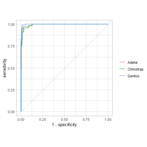
These curves show that the Chinstrap category was the hardest to classify (since the green curve is the farthest from the top left corner).
4.4. Plotting the decision boundary
Finally, we can visualize how our multinomial logistic regression model classifies all possible combinations of values of the predictor variables (bill length and flipper length).
We create this plot in 4 steps:
Step 1: Get the range of the predictor variables.
summary(penguins)
# bill_length_mm  flipper_length_mm      species
# Min.   :32.10   Min.   :172.0     Adelie   :152
# 1st Qu.:39.23   1st Qu.:190.0     Chinstrap: 68
# Median :44.45   Median :197.0     Gentoo   :124
# Mean   :43.92   Mean   :200.9
# 3rd Qu.:48.50   3rd Qu.:213.0
# Max.   :59.60   Max.   :231.0
# NA's   :2       NA's   :2
Step 2: Create a dataframe of 10,000 combinations of predictor values.
possibilities <- expand_grid(
  bill_length_mm = seq(32, 60, length.out = 100),
  flipper_length_mm = seq(172, 231, length.out = 100)
)

possibilities
## A tibble: 10,000 x 2
#   bill_length_mm flipper_length_mm
#            <dbl>             <dbl>
# 1             32              172
# 2             32              173.
# 3             32              173.
# 4             32              174.
# 5             32              174.
# 6             32              175.
# 7             32              176.
# 8             32              176.
# 9             32              177.
#10             32              177.
## ... with 9,990 more rows
## i Use `print(n = ...)` to see more rows
Step 3: Use the multinomial logistic model to predict the outcome for all these 10,000 data points.
possibilities <- bind_cols(possibilities,
                           predict(model_fit, new_data = possibilities))

possibilities
# A tibble: 10,000 x 3
   bill_length_mm flipper_length_mm .pred_class
            <dbl>             <dbl> <fct>
 1             32              172  Adelie
 2             32              173. Adelie
 3             32              173. Adelie
 4             32              174. Adelie
 5             32              174. Adelie
 6             32              175. Adelie
 7             32              176. Adelie
 8             32              176. Adelie
 9             32              177. Adelie
10             32              177. Adelie
# ... with 9,990 more rows
# i Use `print(n = ...)` to see more rows
Step 4: Plot the calculated predictions and the true values.
possibilities |>
  ggplot(aes(x = bill_length_mm, y = flipper_length_mm)) +
  geom_point(aes(color = .pred_class), alpha = 0.1) +
  geom_point(data = penguins, aes(color = species, shape = species),
             size = 2,
             alpha = 0.8) +
  labs(color = "Species", shape = "Species") +
  theme_light()
Output:
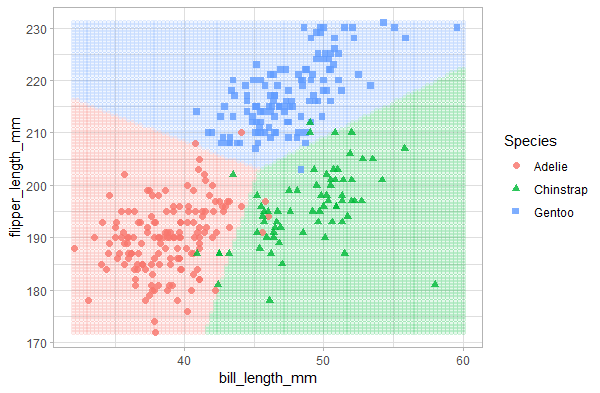
The plot shows that the multinomial logistic regression divided the predictor space into 3 regions and classified penguins accordingly. The points on top represent the real penguin classes. As expected, the Chinstrap category has the most misclassified data points, and the Gentoo category has only 1 misclassified data point.