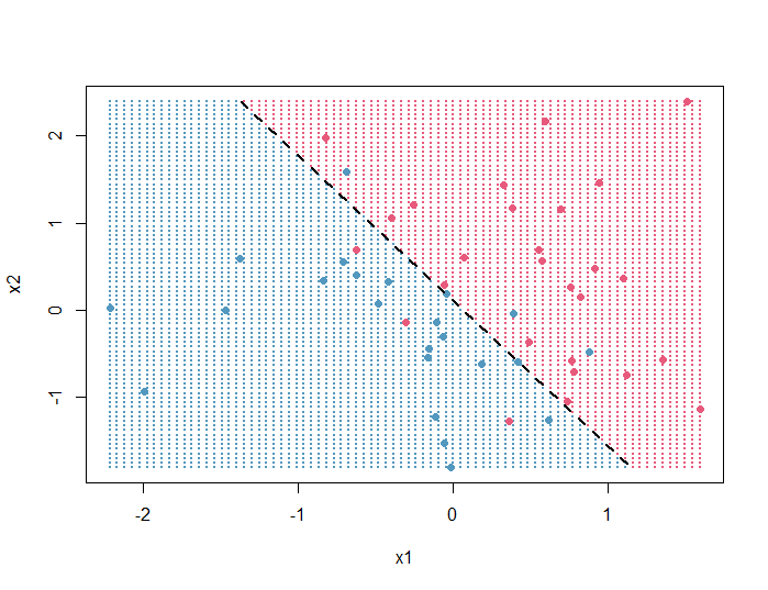
In this article, we will produce the following R plot that represents the decision boundary of a logistic regression model:
Here’s the full code used to generate it:
set.seed(1)
x1 = rnorm(50)
x2 = rnorm(50)
y = (x1 + x2 + rnorm(50)) > 0

model = glm(y ~ x1 + x2, family = binomial)

x1_ticks = seq(min(x1), max(x1), length.out=80)
x2_ticks = seq(min(x2), max(x2), length.out=80)

background_grid = expand.grid(x1_ticks, x2_ticks)
names(background_grid) = c('x1', 'x2')

grid_predictions = predict(model,
                           newdata = background_grid,
                           type = 'response')

plot(background_grid, pch = 20, cex = 0.5, col = ifelse(grid_predictions > 0.5, '#E75A7C', '#5398BE'))
points(x1, x2, pch = 19, col = ifelse(y == TRUE, '#E75A7C', '#5398BE'))

slope = coef(model)[2]/(-coef(model)[3])
intercept = coef(model)[1]/(-coef(model)[3])

clip(min(x1),max(x1), min(x2), max(x2))
abline(intercept, slope, lwd = 2, lty = 2)
Code explanation
First, we create some data (2 continuous variables x1 and x2, and 1 binary variable y) and run a logistic regression:
# create data
set.seed(1)
x1 = rnorm(50)
x2 = rnorm(50)
y = (x1 + x2 + rnorm(50)) > 0

# run logistic regression
model = glm(y ~ x1 + x2, family = binomial)
Next, we will create 2 variables x1_ticks and x2_ticks based on the ranges of x1 and x2, that contain 80 equally spaced values each. Then, we create a dataframe called background_grid that contains all combinations of x1_ticks and x2_ticks (so 80 × 80 = 6400 rows):
# create 2 variables based on x1 and x2 that contain equally spaced values
x1_ticks = seq(min(x1), max(x1), length.out=80)
x2_ticks = seq(min(x2), max(x2), length.out=80)

# extract all combinations of x1_ticks and x2_ticks
background_grid = expand.grid(x1_ticks, x2_ticks)

# change the names of the variables of background_grid
names(background_grid) = c('x1', 'x2')

head(background_grid)
#          x1        x2
# 1 -2.214700 -1.804959
# 2 -2.166472 -1.804959
# 3 -2.118245 -1.804959
# 4 -2.070017 -1.804959
# 5 -2.021789 -1.804959
# 6 -1.973562 -1.804959
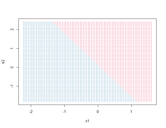
Predict the y values of background_grid according to the logistic regression model, and plot the background:
# predict y values of background_grid
grid_predictions = predict(model,
                           newdata = background_grid,
                           type = 'response')

# plot background
plot(background_grid,
     pch = 20, # points shape
     cex = 0.5, # points size
     col = ifelse(grid_predictions > 0.5, '#E75A7C', '#5398BE'))
     # points colored according to their predicted class
Output:
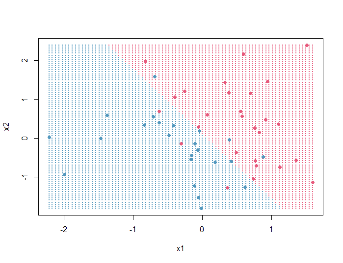
Next, we will plot on top of the background grid the data points (x1, x2) and color them according to their real y values:
points(x1, x2,
       pch = 19, # points shape
       col = ifelse(y == TRUE, '#E75A7C', '#5398BE'))
       # points colored according to their real y values
Output:
Finally, we will add the decision boundary:
(For information on the formula used to calculate the slope and intercept of the decision boundary line, see this article on StackExchange)
# calculate the slope and intercept of the decision boundary line
slope = coef(model)[2]/(-coef(model)[3])
intercept = coef(model)[1]/(-coef(model)[3])

# limit the decision boundary line
# by the min and max values of x1 and x2
clip(min(x1),max(x1), min(x2), max(x2))

# plot the decision boundary
abline(intercept, slope,
       lwd = 2, # line thickness
       lty = 2) # type dashed
Output:
The plot shows that the logistic regression model misclassified some points, so if you want, you can try adding quadratic terms to the model to see if you get a better fit.