Let’s start by creating our own data, consisting of 2 categorical variables: gender and smoking:
set.seed(10)

# create 2 categorical variables with 80 observations each
gender = sample(c('Female', 'Male'), 80, replace = TRUE)
smoking = sample(c('Past smoker', 'Current smoker', 'Non-smoker'), 80, replace = TRUE)

# pack these variables into a data frame
dat = data.frame(gender = as.factor(gender),
                 smoking = as.factor(smoking))

# what our data look like
str(dat)
# outputs:
#'data.frame':	80 obs. of  2 variables:
# $ gender : Factor w/ 2 levels "Female","Male": 1 1 2 2 2 1 2 2 1 1 ...
# $ smoking: Factor w/ 3 levels "Current smoker",..: 2 1 3 2 1 1 1 2 2 2 ...
Next, we will create a frequency table and a bar plot to summarize these data one variable at a time, then we will create a contingency table and a stacked bar plot to describe the relationship between the 2 variables.
1. Summarizing gender and smoking, one variable at a time
A frequency table shows the number of occurrences of each category of a variable:
table(dat$gender)
# outputs:
# Female   Male
#     40     40

table(dat$smoking)
# outputs:
# Current smoker     Non-smoker    Past smoker
#             26             30             24
Interpretation: Our sample consists of 40 females and 40 males. And 26 participants are current smokers, 24 are past smokers, and 30 are non-smokers.
We can use bar plots to visualize these 2 frequency tables:
par(mfrow=c(1,2)) # show the following plots side by side

barplot(table(dat$gender), ylab = 'Number of participants')
barplot(table(dat$smoking), ylab = 'Number of participants')
Output:

Returning to tables, instead of showing the number of occurrences of each category, we can show the proportion of each category:
prop.table(table(dat$gender))
# outputs:
# Female   Male
#    0.5    0.5

prop.table(table(dat$smoking))
# outputs:
# Current smoker     Non-smoker    Past smoker
#          0.325          0.375          0.300
Interpretation: 50% of the participants are females and 50% are males. And 32.5% of the total participants are current smokers, 30% are past smokers and 37.5% are non-smokers.
Again, we can create bar plots to visualize these tables:
par(mfrow=c(1,2)) # show the following plots side by side

barplot(prop.table(table(dat$gender)), ylab = 'Proportion of participants')
barplot(prop.table(table(dat$smoking)), ylab = 'Proportion of participants')
Output:

2. Describing the relationship between gender and smoking
A contingency table (a.k.a. a 2-way frequency table or a frequency table with 2 variables) describes the relationship between 2 categorical variables. Each cell in this table corresponds to the number of occurrences of a particular combination of values of the 2 variables.
table(dat$gender, dat$smoking)
# outputs:
#          Current smoker Non-smoker Past smoker
#   Female             12         17          11
#   Male               14         13          13
Interpretation: For instance, in our sample, 12 participants are females and current smokers.
We can also show the proportion of individuals in each cell. But we have 3 ways to do it:
1. Showing total proportions
Here, each cell represents the count of individuals in this category divided by the total sample size:
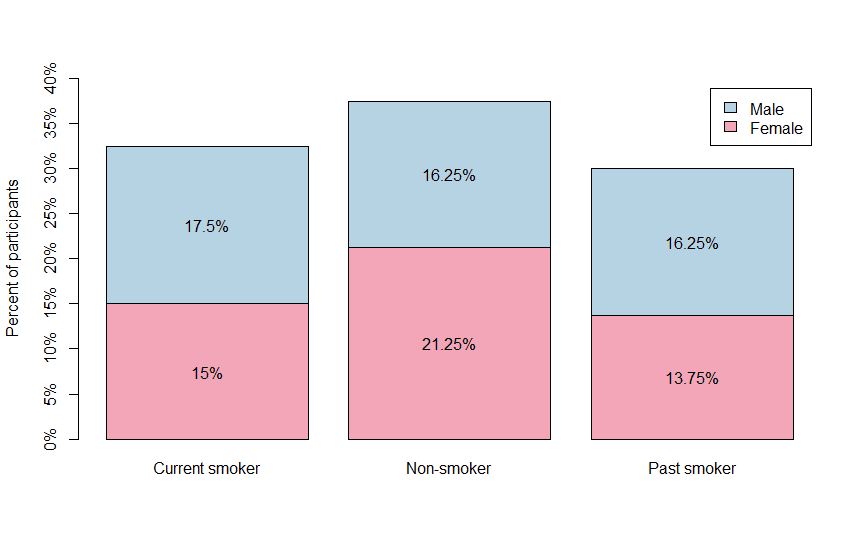
table1 = prop.table(table(dat$gender, dat$smoking))
table1
# outputs:
#          Current smoker Non-smoker Past smoker
#   Female         0.1500     0.2125      0.1375
#   Male           0.1750     0.1625      0.1625

# we can add margins to the table to make it clearer
addmargins(table1)
# outputs:
#          Current smoker Non-smoker Past smoker    Sum
#   Female         0.1500     0.2125      0.1375 0.5000
#   Male           0.1750     0.1625      0.1625 0.5000
#   Sum            0.3250     0.3750      0.3000 1.0000
(Notice that all the cells in the table sum up to 1)
Interpretation: The first number, 0.15 is the proportion of individuals in our sample who are both females and current smokers. More generally, we can say that our sample contains mostly male current smokers (17.5%). And females who are past smokers is the smallest category in our data (only 13.75%).
2. Showing row proportions
Here, each cell represents the count of individuals in this category divided by the row total:
table2 = prop.table(table(dat$gender, dat$smoking), 1)
table2
# outputs:
#          Current smoker Non-smoker Past smoker
#   Female          0.300      0.425       0.275
#   Male            0.350      0.325       0.325

addmargins(table2)
# outputs:
#          Current smoker Non-smoker Past smoker   Sum
#   Female          0.300      0.425       0.275 1.000
#   Male            0.350      0.325       0.325 1.000
#   Sum             0.650      0.750       0.600 2.000
(Notice that each row sums up to 1)
Interpretation: For instance, 0.3 is the proportion of females who currently smoke (⚠ this is different from the proportion of current smokers who are females). More generally we can say that, in our sample, most females are non-smokers (42.5%), but most males are current smokers (35%).
3. Showing column proportions
Here, each cell represents the count of individuals in this category divided by the column total:
table3 = prop.table(table(dat$gender, dat$smoking), 2)
table3
# outputs:
#          Current smoker Non-smoker Past smoker
#   Female      0.4615385  0.5666667   0.4583333
#   Male        0.5384615  0.4333333   0.5416667

addmargins(table3)
# outputs:
#          Current smoker Non-smoker Past smoker       Sum
#   Female      0.4615385  0.5666667   0.4583333 1.4865385
#   Male        0.5384615  0.4333333   0.5416667 1.5134615
#   Sum         1.0000000  1.0000000   1.0000000 3.0000000
(Notice that each column sums up to 1)
Interpretation: For instance, 0.4615… is the proportion of current smokers who are females (⚠ this is different from the proportion females who are current smokers). More generally we can say that, in our sample, most current and past smokers are males (53.85% and 54.16%, respectively) and most non-smokers are females (56.67%).
We can use a stacked bar plot to visualize a contingency table:
library(scales) # to show percentages on the y-axis

x = barplot(prop.table(table(dat$gender, dat$smoking)),
            col = rep(c('#F2A6B8', '#B5D3E3')),
            legend = TRUE,
            ylim = c(0, 0.4),
            yaxt = 'n', # remove y-axis
            ylab = 'Percent of participants')

# creating a y-axis with percentages
yticks = seq(0, 0.4, by = 0.05)
axis(2, at = yticks, lab = percent(yticks))

# showing the values of each category
y = prop.table(table(dat$gender, dat$smoking))
text(x, y[1,]/2, labels = paste0(as.character(y[1,]*100), '%')) # placing female values
text(x, y[1,] + y[2,]/2, labels = paste0(as.character(y[2,]*100), '%')) # placing male values
Output:
Another plot that is related to the stacked bar plot is the mosaic plot:
mosaicplot(prop.table(table(dat$smoking, dat$gender)),
           col = c('#F2A6B8', '#B5D3E3'),
           main = '')
Output:

The width of each column of this mosaic plot corresponds to the proportions of different categories of smoking. For example, we can see that non-smoker is a bigger category than past smokers since it has a wider base.
The horizontal “gender” splits in this plot show that non-smoker is the only category with more females than males.