In this tutorial, we will use the discoveries dataset available in R as an example of a time series. The dataset contains yearly count of important scientific discoveries from 1860 to 1959.
1. Load the data
library(fpp3)

dat <- as_tsibble(discoveries)

dat
## A tsibble: 100 x 2 [1Y]
#   index value
#   <dbl> <dbl>
# 1  1860     5
# 2  1861     3
# 3  1862     0
# 4  1863     2
# 5  1864     0
# 6  1865     3
# 7  1866     2
# 8  1867     3
# 9  1868     6
#10  1869     1
## ℹ 90 more rows
## ℹ Use `print(n = ...)` to see more rows
A tsibble is a time series table that has an index (the year) and a value (the number of discoveries).
This format will make the analysis and plotting a lot easier than an ordinary data.frame or tibble.
2. Plot the time series
autoplot(dat, value)
Output:
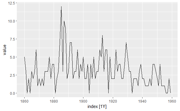
The function autoplot() automatically plots the change in the variable value over time given that the object dat is a tsibble.
3. Check if the data is white noise
In order to determine if our data is white noise (i.e. consists of random values), we will run a statistical test: the Ljung-Box test.
- H0: The data is white noise.
- H1: There exists an actual pattern in the data.
We will use lag = 10, as suggested by Hyndman and Athanasopoulos.
features(dat, value, ljung_box, lag = 10)
## A tibble: 1 × 2
#  lb_stat lb_pvalue
#    <dbl>     <dbl>
#1    28.2   0.00169
The p-value of the Ljung-Box test is 0.00169 (< 0.05), so we can reject the null hypothesis that the observed pattern is just random noise. In other words, our data support the alternative hypothesis that scientific discoveries are not random events that occur over time.
4. Fit a simple time series model
A simple model that we can use to fit our data is the naïve model, which predicts for each period the value of the last observation.
# model the data
mod <- model(dat, NAIVE(value))

# get the fitted values and the residuals
fitted <- augment(mod)

fitted
## A tsibble: 100 x 6 [1Y]
## Key:       .model [1]
#   .model       index value .fitted .resid .innov
#   <chr>        <dbl> <dbl>   <dbl>  <dbl>  <dbl>
# 1 NAIVE(value)  1860     5      NA     NA     NA
# 2 NAIVE(value)  1861     3       5     -2     -2
# 3 NAIVE(value)  1862     0       3     -3     -3
# 4 NAIVE(value)  1863     2       0      2      2
# 5 NAIVE(value)  1864     0       2     -2     -2
# 6 NAIVE(value)  1865     3       0      3      3
# 7 NAIVE(value)  1866     2       3     -1     -1
# 8 NAIVE(value)  1867     3       2      1      1
# 9 NAIVE(value)  1868     6       3      3      3
#10 NAIVE(value)  1869     1       6     -5     -5
## ℹ 90 more rows
## ℹ Use `print(n = ...)` to see more rows
Let’s plot the fitted values of the model (in red) and compare them to the real values (in black):
autoplot(fitted, value) + # real values
  autolayer(fitted, .fitted, color = "red") # fitted values
Output:
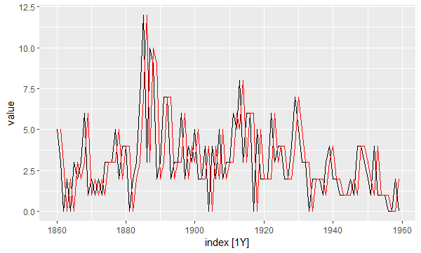
In order to determine whether this model fits the data well enough, we need to look at the residuals. Specifically, we need them to be: (1) uncorrelated, (2) normally distributed with mean zero, and (3) have constant variance over time.
gg_tsresiduals(mod)
Output:
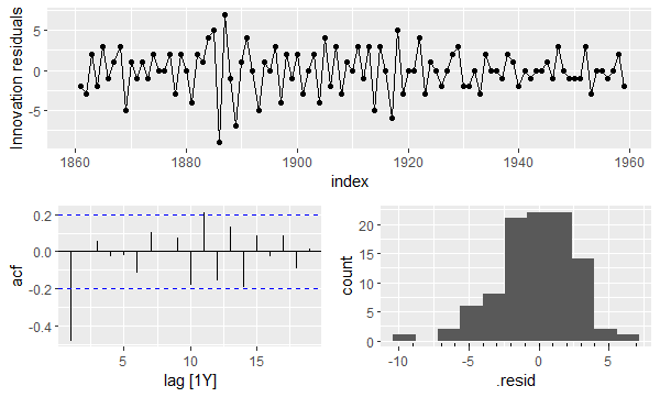
The top plot shows that the variance of the residuals changes over time. The bottom left plot shows that the residuals are correlated (2 spikes extend beyond the blue lines). And the bottom right plot shows that the residuals are not normally distributed.
Therefore, we can conclude that the naïve model is a poor fit to our data.