In this tutorial, we will use the packages ggmap and COVID19 to create the following plot:
1. Downloading and plotting the map
Since we are going to plot the Mediterranean region only, we first need to specify its borders. A simple Google search shows that these are roughly:
- Between -10 and 40 in longitude.
- Between 18 and 50 in latitude.
library(ggmap)
library(ggthemes) # for theme_map()

# Mediterranean region borders
area <- c(left = -10,
          right = 40,
          bottom = 18,
          top = 50)

# download the map
# zoom=5 avoids downloading a lot of data about this region
med_map <- get_stamenmap(bbox = area,
                         zoom = 5)

# plot the map
ggmap(med_map) +
  theme_map()
Output:
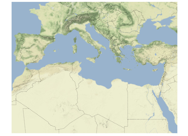
Since we don’t want country labels in our map, we will set maptype = "terrain-background" inside the get_stamenmap() function:
# download the map
med_map <- get_stamenmap(bbox = area,
                         zoom = 5,
                         maptype = "terrain-background")

# plot the map
ggmap(med_map) +
  theme_map()
Output:
2. Plotting COVID-19 deaths data on the map
Next, we will load the COVID19 package in R to get the deaths statistics for COVID-19. We will also use the tidyverse package for some data manipulation.
library(COVID19)
library(tidyverse)

df <- covid19()
The dataset has a lot of variables, but we are only interested in 3: longitude, latitude, and deaths. We will also limit the data to our region of interest:
region_df <- df |>
  select(date, longitude, latitude, deaths) |>
  filter(!is.na(deaths)) |>
  filter(longitude > -10 & longitude < 40) |>
  filter(latitude > 18 & latitude < 50)

head(region_df)
#        date longitude latitude deaths
#1 2020-03-18        29       47      1
#2 2020-03-19        29       47      1
#3 2020-03-20        29       47      1
#4 2020-03-21        29       47      1
#5 2020-03-22        29       47      1
#6 2020-03-23        29       47      1
Since the variable deaths represents the cumulative number of deaths, we only need the last number (corresponding to the last date) for each combination of longitude and latitude:
deaths_df <- region_df |>
  group_by(longitude, latitude) |>
  slice_tail(n = 1)

head(deaths_df)
## A tibble: 6 x 4
## Groups:   longitude, latitude [6]
#  date       longitude latitude deaths
#  <date>         <dbl>    <dbl>  <int>
#1 2022-05-10     -8.22     39.4  23004
#2 2023-03-09     -7.09     31.8  16296
#3 2023-03-09     -5.35     36.1    111
#4 2023-03-09     -4        40   119479
#5 2023-03-09      1.52     42.5    165
#6 2022-10-06      1.66     28.0   6881
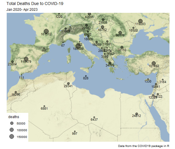
Adding these data to the map:
ggmap(med_map) +
  theme_map() +
  geom_point(aes(x = longitude, y = latitude, size = deaths),
             alpha = 0.5,
             data = deaths_df) +
  geom_text(aes(x = longitude, y = latitude, label = deaths),
            size = 3,
            nudge_y = -0.5,
            data = deaths_df) +
  labs(title = "Total Deaths Due to COVID-19",
       subtitle = "Jan 2020- Apr 2023",
       caption = "Data from the COVID19 package in R")
Output: