In this article, we will produce the following plot in R:
1. Load the data
First, we will use the COVID19 package in R to download data for Lebanon. We will limit our analysis to 2 variables: (1) the date and (2) the number of new daily cases.
library(COVID19) # load data
library(tidyverse) # manipulate data

dat <- tibble(covid19(country = "Lebanon")) |>
  mutate(new_cases = confirmed - lag(confirmed)) |>
  select(date, new_cases)

dat
## A tibble: 1,162 × 2
#   date       daily_cases
#   <date>           <int>
# 1 2020-01-03          NA
# 2 2020-01-04          NA
# 3 2020-01-05          NA
# 4 2020-01-06          NA
# 5 2020-01-07          NA
# 6 2020-01-08          NA
# 7 2020-01-09          NA
# 8 2020-01-10          NA
# 9 2020-01-11          NA
#10 2020-01-12          NA
## ℹ 1,152 more rows
## ℹ Use `print(n = ...)` to see more rows
2. Count monthly cases
To do that, we group data by year and month, and then we count the cases:
# count new cases each month
dat <- dat |>
  group_by(year = year(date),
           month = month(date)) |>
  count(wt = daily_cases, name = "monthly_cases")

dat
## A tibble: 39 × 3
## Groups:   year, month [39]
#    year month monthly_cases
#   <dbl> <dbl>         <int>
# 1  2020     1             0
# 2  2020     2             3
# 3  2020     3           466
# 4  2020     4           255
# 5  2020     5           495
# 6  2020     6           558
# 7  2020     7          2777
# 8  2020     8         12753
# 9  2020     9         22326
#10  2020    10         41594
## ℹ 29 more rows
## ℹ Use `print(n = ...)` to see more rows
3. Transform to time series table (tsibble)
Next, we transform the tibble obejct into a tsibble using the fpp3 package, and we specify that we want monthly data to be the index of the table:
library(fpp3) # use time series tables

# transform to time series
dat <- dat |>
  unite(date, year, month) |>
  mutate(date = yearmonth(date)) |>
  as_tsibble(index = date)

dat
## A tsibble: 39 x 2 [1M]
#       date monthly_cases
#      <mth>         <int>
# 1 2020 Jan             0
# 2 2020 Feb             3
# 3 2020 Mar           466
# 4 2020 Apr           255
# 5 2020 May           495
# 6 2020 Jun           558
# 7 2020 Jul          2777
# 8 2020 Aug         12753
# 9 2020 Sep         22326
#10 2020 Oct         41594
## ℹ 29 more rows
## ℹ Use `print(n = ...)` to see more rows
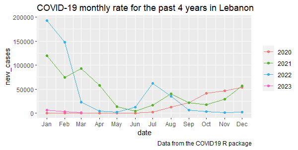
4. Plot the monthly distribution
Now, we can use the function gg_season() and specify that we want to plot the variable called monthly_cases:
df |> gg_season(monthly_cases) +
  geom_point()
Output:
Interpretation: The graph illustrates the seasonal variation of COVID-19 infection rate in Lebanon from 2020 to mid 2023. The infection rate reached its highest levels in the winter months (November to February) and in the summer months (July and August). These periods coincide with longer indoor stays due to cold weather and higher tourism activities respectively. The infection rate declined significantly by the end of 2022.