In this tutorial, we will use a linear regression model to examine the relationship between the Google search trends for the terms headache and ibuprofen.
1. Prepare the data
1.1. Download the data
The package gtrendsR presents an interface to retrieve the number of Google searches over time for a specific term:
library(gtrendsR)

# download trends for the words "headache" and "ibuprofen"
raw_data <- gtrends(c("headache", "ibuprofen"),
                  time = "2020-01-01 2023-01-01",
                  gprop = "web",
                  onlyInterest = TRUE)$interest_over_time

head(raw_data)
#        date hits  keyword   geo                  time gprop category
#1 2020-01-05   43 headache world 2020-01-01 2023-01-01   web        0
#2 2020-01-12   41 headache world 2020-01-01 2023-01-01   web        0
#3 2020-01-19   42 headache world 2020-01-01 2023-01-01   web        0
#4 2020-01-26   41 headache world 2020-01-01 2023-01-01   web        0
#5 2020-02-02   40 headache world 2020-01-01 2023-01-01   web        0
#6 2020-02-09   41 headache world 2020-01-01 2023-01-01   web        0
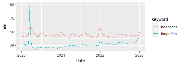
1.2. Plot the trends
library(fpp3) # to work with time series data

raw_data |>
  ggplot(aes(x = date, y = hits, color = keyword)) +
  geom_line()
Output:
1.3. Group data by month
trends_df <-
  as_tibble(raw_data) |>
  group_by(year = year(date),
           month = month(date),
           keyword) |>
  count(wt = hits, name = "hits")

trends_df
## A tibble: 74 × 4
## Groups:   year, month, keyword [74]
#    year month keyword    hits
#   <dbl> <dbl> <chr>     <int>
# 1  2020     1 headache    167
# 2  2020     1 ibuprofen   100
# 3  2020     2 headache    166
# 4  2020     2 ibuprofen   103
# 5  2020     3 headache    266
# 6  2020     3 ibuprofen   248
# 7  2020     4 headache    201
# 8  2020     4 ibuprofen    80
# 9  2020     5 headache    220
#10  2020     5 ibuprofen    95
## ℹ 64 more rows
## ℹ Use `print(n = ...)` to see more rows
Next, we will create 2 separate variables (headache and ibuprofen) from the column keyword:
trends_df <- trends_df |>
  pivot_wider(names_from = keyword,
              values_from = hits)
trends_df
## A tibble: 37 × 4
## Groups:   year, month [37]
#    year month headache ibuprofen
#   <dbl> <dbl>    <int>     <int>
# 1  2020     1      167       100
# 2  2020     2      166       103
# 3  2020     3      266       248
# 4  2020     4      201        80
# 5  2020     5      220        95
# 6  2020     6      179        83
# 7  2020     7      195        87
# 8  2020     8      219       105
# 9  2020     9      176        84
#10  2020    10      173        85
## ℹ 27 more rows
## ℹ Use `print(n = ...)` to see more rows
And we plot the relationship between headache and ibuprofen:
trends_df |>
  ggplot(aes(x = ibuprofen, y = headache)) +
  geom_point() +
  geom_smooth(method = "lm", se = FALSE)
Output:
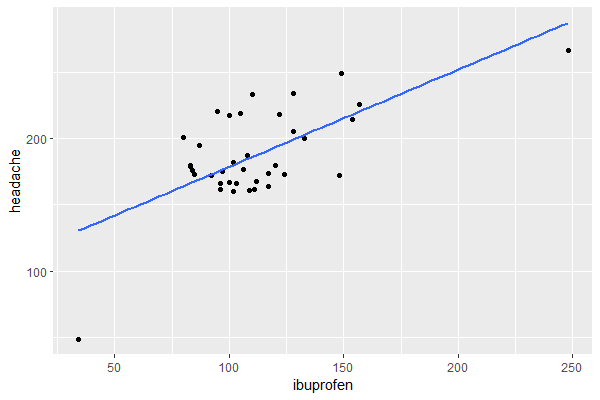
The relationship looks somewhat linear, so a linear regression model will be appropriate.
As a last step in the data transformation, we group the month and year variables into 1 variable and we transform the data frame into a time series table (tsibble):
trends_ts <- trends_df |>
  unite(date, year, month) |>
  mutate(date = yearmonth(date)) |>
  as_tsibble(index = date)

trends_ts
## A tsibble: 37 x 3 [1M]
#       date headache ibuprofen
#      <mth>    <int>     <int>
# 1 2020 Jan      167       100
# 2 2020 Feb      166       103
# 3 2020 Mar      266       248
# 4 2020 Apr      201        80
# 5 2020 May      220        95
# 6 2020 Jun      179        83
# 7 2020 Jul      195        87
# 8 2020 Aug      219       105
# 9 2020 Sep      176        84
#10 2020 Oct      173        85
## ℹ 27 more rows
## ℹ Use `print(n = ...)` to see more rows
2. Run linear regression
2.1. Run linear regression and check the output
We will now use a Time Series Linear Model (TSLM) to investigate the degree of association between the Google search frequencies of the words headache and ibuprofen.
lin_reg <- model(trends_ts, TSLM(headache ~ ibuprofen))

report(lin_reg)
#Series: headache
#Model: TSLM
#
#Residuals:
#    Min      1Q  Median      3Q     Max
#-81.409 -17.114  -1.486  13.753  47.006
#
#Coefficients:
#            Estimate Std. Error t value Pr(>|t|)
#(Intercept) 105.5416    15.9110   6.633 1.14e-07 ***
#ibuprofen     0.7314     0.1370   5.339 5.74e-06 ***
#---
#Signif. codes:  0 ‘***’ 0.001 ‘**’ 0.01 ‘*’ 0.05 ‘.’ 0.1 ‘ ’ 1
#
#Residual standard error: 27.15 on 35 degrees of freedom
#Multiple R-squared: 0.4489,	Adjusted R-squared: 0.4331
#F-statistic: 28.51 on 1 and 35 DF, p-value: 5.7435e-06
The model shows that the relationship is positive and statistically significant.
But maybe we can do better by adding a linear trend as a predictor in the model (this is equivalent to adding a variable that represents row numbers):
lin_reg <- model(trends_ts, TSLM(headache ~ ibuprofen + trend()))

report(lin_reg)
#Series: headache
#Model: TSLM
#
#Residuals:
#    Min      1Q  Median      3Q     Max
#-52.175 -10.126  -1.794  13.898  40.361
#
#Coefficients:
#            Estimate Std. Error t value Pr(>|t|)
#(Intercept) 124.6388    14.2737   8.732 3.33e-10 ***
#ibuprofen     0.7972     0.1167   6.832 7.30e-08 ***
#trend()      -1.3914     0.3561  -3.907 0.000422 ***
#---
#Signif. codes:  0 ‘***’ 0.001 ‘**’ 0.01 ‘*’ 0.05 ‘.’ 0.1 ‘ ’ 1
#
#Residual standard error: 22.89 on 34 degrees of freedom
#Multiple R-squared: 0.6197,	Adjusted R-squared: 0.5973
#F-statistic:  27.7 on 2 and 34 DF, p-value: 7.2947e-08
Indeed, the model is now better as the trend variable is statistically significant and the adjusted R-squared is higher than the previous model.
2.2. Check how well the fitted values match the actual values
We will do this by comparing the plot of the time series for the fitted values and the actual trend of headache:
fitted <- augment(lin_reg)

fitted
## A tsibble: 37 x 6 [1M]
## Key:       .model [1]
#   .model                                   date headache .fitted .resid .innov
#   <chr>                                   <mth>    <int>   <dbl>  <dbl>  <dbl>
# 1 TSLM(headache ~ ibuprofen + trend()) 2020 Jan      167    203. -36.0  -36.0
# 2 TSLM(headache ~ ibuprofen + trend()) 2020 Feb      166    204. -38.0  -38.0
# 3 TSLM(headache ~ ibuprofen + trend()) 2020 Mar      266    318. -52.2  -52.2
# 4 TSLM(headache ~ ibuprofen + trend()) 2020 Apr      201    183.  18.1   18.1
# 5 TSLM(headache ~ ibuprofen + trend()) 2020 May      220    193.  26.6   26.6
# 6 TSLM(headache ~ ibuprofen + trend()) 2020 Jun      179    182.  -3.46  -3.46
# 7 TSLM(headache ~ ibuprofen + trend()) 2020 Jul      195    184.  10.7   10.7
# 8 TSLM(headache ~ ibuprofen + trend()) 2020 Aug      219    197.  21.8   21.8
# 9 TSLM(headache ~ ibuprofen + trend()) 2020 Sep      176    179.  -3.08  -3.08
#10 TSLM(headache ~ ibuprofen + trend()) 2020 Oct      173    178.  -5.49  -5.49
## ℹ 27 more rows
## ℹ Use `print(n = ...)` to see more rows

fitted |>
  ggplot(aes(x = date)) +
  geom_line(aes(y = headache)) +
  geom_line(aes(y = .fitted), color = "red")
Output:
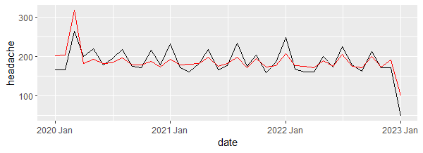
The plot shows that the model produced values that are close enough to the real values.
3. Check linear regression assumptions
Assumptions #1 and #2: the residuals must be uncorrelated and normally distributed
gg_tsresiduals(lin_reg)
Output:
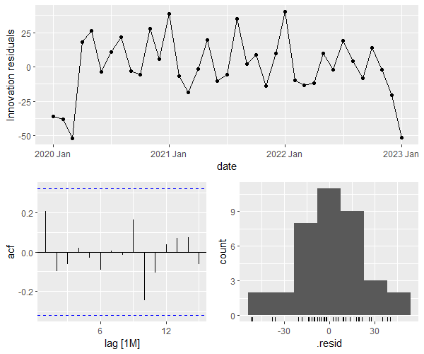
The bottom left plot shows that the residuals are not autocorrelated (since no spike surpasses the blue borders), and the bottom right plot shows that the residuals’ distribution is close to normal.
We can also check the Ljung-Box test, where:
- H0: the residuals are independently distributed (not autocorrelated).
- H1: the residuals are autocorrelated.
# we use lag = 10 as recommended by Hyndman and Athanasopoulos (see references below)
features(fitted, .resid, ljung_box, lag = 10)
## A tibble: 1 × 3
#  .model                               lb_stat lb_pvalue
#  <chr>                                  <dbl>     <dbl>
#1 TSLM(headache ~ ibuprofen + trend())    7.31     0.696
The test is not statistically significant meaning that we don’t have enough evidence that the residuals are autocorrelated (which is what we want).
Assumption #3: the residuals must have equal variance (i.e. homoscedastic)
augment(lin_reg) |>
  ggplot(aes(x = .fitted, y = .resid)) +
  geom_point()
Output:
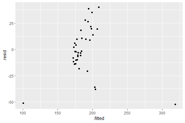
This assumption is satisfied since the plot of the residuals versus the fitted values does not show any discernible pattern, i.e. no fan, blob, or butterfly shape (for more information see: Understand Linear Regression Assumptions).
Assumption #4: the residuals must not be related to the predictor(s)
If the plot of the residuals versus any of the predictors in the linear model shows a discernible pattern, this means that the relationship may be non-linear and should be accounted for in the model.
resid_df <-
  residuals(lin_reg) |>
  left_join(trends_ts, join_by(date))

resid_df
## A tsibble: 37 x 5 [1M]
## Key:       .model [1]
#   .model                                   date .resid headache ibuprofen
#   <chr>                                   <mth>  <dbl>    <int>     <int>
# 1 TSLM(headache ~ ibuprofen + trend()) 2020 Jan -36.0       167       100
# 2 TSLM(headache ~ ibuprofen + trend()) 2020 Feb -38.0       166       103
# 3 TSLM(headache ~ ibuprofen + trend()) 2020 Mar -52.2       266       248
# 4 TSLM(headache ~ ibuprofen + trend()) 2020 Apr  18.1       201        80
# 5 TSLM(headache ~ ibuprofen + trend()) 2020 May  26.6       220        95
# 6 TSLM(headache ~ ibuprofen + trend()) 2020 Jun  -3.46      179        83
# 7 TSLM(headache ~ ibuprofen + trend()) 2020 Jul  10.7       195        87
# 8 TSLM(headache ~ ibuprofen + trend()) 2020 Aug  21.8       219       105
# 9 TSLM(headache ~ ibuprofen + trend()) 2020 Sep  -3.08      176        84
#10 TSLM(headache ~ ibuprofen + trend()) 2020 Oct  -5.49      173        85
## ℹ 27 more rows
## ℹ Use `print(n = ...)` to see more rows

resid_df |>
  ggplot(aes(x = ibuprofen, y = .resid)) +
  geom_point()
Output:
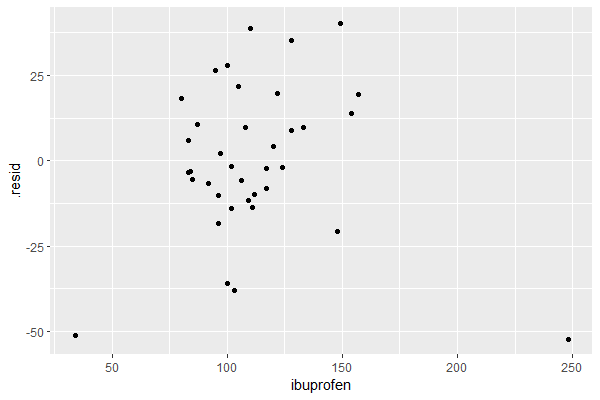
The plot shows no discernible pattern, suggesting that the linear model is a good fit to the data.
References
- Hyndman RJ, Athanasopoulos G. Forecasting: Principles and Practice. 3rd ed. edition. Otexts; 2021.